BRP Blog
 Chloé Baaklini

Discover how data visualisation can transform the way your businesses analyse and interpret data.
The Importance of Data Visualisation
Data visualisation is a powerful tool that allows businesses to understand complex data by presenting it in a visual format. It helps to simplify information and make it more accessible to a wider audience. By using charts, graphs, and other visual elements, data visualisation enables users to quickly grasp the key insights and trends hidden within the data.
✨ One of the main benefits of data visualisation is its ability to simplify complex data sets.
👍 Another advantage of data visualisation is its ability to enhance decision-making.
💬 Furthermore, data visualisation plays a crucial role in improving communication and collaboration within an organisation.
📉 Data visualisation also enables businesses to identify trends, patterns or risks that may otherwise go unnoticed.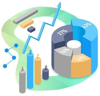
Enhancing Decision Making with Visual Data Analysis
Visual data analysis is a universal language and fundamental aspect of data visualisation that plays a pivotal role in elevating decision-making processes.
👉 One of the primary benefits of visual data analysis lies in its ability to swiftly identify patterns and trends or even risks which helps decision-makers to spot:
- interdependence or a connection between different variable quantities
- a data point on a graph or in a set of results that is very much higher or lower than other data points.
- and other valuable insights that may not be apparent when examining raw data.
📈 Visual data analysis enables businesses to explore data from various angles and perspectives. Through the use of interactive visualisations, users can delve deep into the data, filter it based on specific criteria, and explore different scenarios such as:
- Terminated membership based on age range the past year.
- New membership VS terminated memberships, the past quarter.
- Overview of all current members based on age and gender.
- Total sales amount in a given period against the same period last year.
💡As a gym owner, you can assess facility performance and determine the success of your fitness concept in specific cities or regions. This information guides your decision-making for opening future facilities. You can even use data to determine the popularity of instructors and classes occupancy, in order to optimise your offerings and allocate resources effectively.
✨ This shows that visual aids helps acquire an understanding of the data and uncovers valuable insights that may have been overlooked, to help your business grow. In other words, this allows you to be proactive instead of reactive!
Improving Communication and Collaboration
Effective communication and collaboration are vital components of a successful organisation. Data visualisation plays a pivotal role in enhancing communication and collaboration by presenting complex information in a more accessible and understandable manner.
💬 One of the key advantages of data visualisation in communication is:
- simplifying tricky data sets making it easier for stakeholders to comprehend and engage with the data.
- helping your team to effectively share and discuss information such as complex concepts, relationships, and trends.
- capturing attention and curiosity of your team.
- and aligning them!
😎 By using more visually appealing aids, managers can for example inform their team about:
- rush hours: the primetime during the week or weekends at the gym.
- Gym members behavior: such as the popularity of group activities.
- Members development over a period of time filtering by facility / location.
- Unique visits at the facility compared to the same period last year.
- and so much more!
✨ Instead of overwhelming your team with raw data in tables or spreadsheets, data visualisation provides a clear way to present relevant information. So put down your excel sheet because it is time for an upgrade!
Identifying Trends and Patterns
Unveiling trends and patterns is an essential task for businesses as it unlocks valuable insights and empowers gym owners and decision-makers. Data visualisation plays a pivotal role in this process by presenting data in a visual format that simplifies spotting and comprehending these trends and patterns.
💥 One of the primary advantages of data visualisation in identifying trends and patterns is its ability to:
- showcase data over time.
- uncover trends, patterns, and fluctuations that may not be evident when examining raw data.
- identify underlying dynamics and enable them to make predictions about future outcomes.
🤔 Through interactive visualisations, users can:
- filter and group data based on specific criteria, empowering them to identify trends and patterns across different dimensions.
- gain valuable insights and a holistic understanding of the data like for example the average number of participants in group activities grouped by activity.
- quickly identify outliers and anomalies that may indicate significant patterns or abnormalities, like the difference in the total number of visits at the facility against the same period last year.
- detect unusual data points or trends that needs further investigation such as churn rate in percentage.
✨ This ability to identify potential areas for improvement or optimisation is invaluable for gyms striving for growth and success.
In Conclusion...
🗣️ Visual data empowers leaders and gym managers to:
- make well-informed decisions.
- take appropriate actions based on the knowledge gained.
- save time and energy.
- improve sales revenue.
- convey information to other stakeholders in a simpler way and engage with them.
- facilitate knowledge sharing and team-work within the team.